At a glance
- What changed
- A separate location for Pine indicator tables.
- Who it affects
- People using indicators that display tables.
- When
- Announced September 15, 2026.
TradingView welcome offer and conditions ↓
A less crowded place for indicator tables
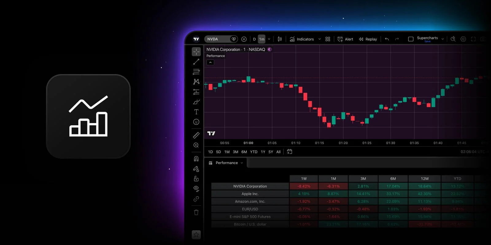
TradingView now lets users move Pine indicator tables below the chart. Right-click a table or use the indicator’s More menu to move it. All tables from that script move together. The panel can hold several indicators, with a context menu to switch between them or move tables back.
The change addresses a familiar reading problem: a useful dashboard can occupy the same space as the candles you want to inspect. Giving each task its own area can make the layout easier to follow.
[1]What a Pine table actually represents
Pine Script is TradingView’s scripting language for indicators and other chart tools. Its table documentation describes a table as a grid whose position is independent of individual bars. That makes it useful for a compact dashboard: labels, values and status messages can stay together without being attached to a particular candle.
One detail prevents a common misreading. Displayed cells represent the table’s last state from the script’s execution. Moving the cursor across older candles does not make those cells become a historical reading for the candle under the cursor. The documentation contrasts this with other chart displays that show values for the selected bar. A table’s number therefore needs its own label and context.
[2]An example of why placement matters
Imagine your chart contains a table with three rows: trend direction, a volatility reading and the script’s most recent status. The table is positioned over the right-hand candles, exactly where you are trying to compare the latest price movement with an earlier level. You can read the table, or you can see that part of the chart clearly, but the two tasks compete for the same space.
In this invented layout, moving the table below the chart separates those tasks. You can inspect the candles first, then look down for the accompanying figures. The benefit is a clearer arrangement of information. It does not follow that the trend reading becomes more accurate, or that the volatility figure uses a different formula because its position changed.
A useful personal test is to perform the same reading task before and after the move. Choose one question, such as identifying the latest close and then reading the dashboard’s status. Notice whether your eyes can find both without covering something important. This is a practical comparison you can make yourself, rather than a performance claim about the update.
Avoid mixing present values with historical candles
Consider another hypothetical example: the table currently displays a value of 24, while your cursor is over a candle from two weeks earlier. Writing “the indicator was 24 at that earlier candle” would combine two different references. The cursor location alone does not establish when the table’s value was calculated.
For notes or screenshots, include the table label and the relevant chart context rather than copying an isolated number. If you need a historical value, inspect how that particular script provides history. A dashboard can be excellent for a current summary while being the wrong display for reconstructing a sequence of past observations.
This also matters when sharing a chart with someone else. Explain which part is a current dashboard and which part is the historical price plot. A short description of that distinction can prevent a much larger misunderstanding about whether the indicator signaled something before or after an event.
Deciding which layout works for you
We would start by relocating the table that obstructs the chart most, then check whether the resulting panel remains readable at the window size normally used. A full-width desktop layout and a narrow laptop window create different space constraints. There is no need to move every table simply because the option exists.
The selector below compares a crowded layout with a time-labeling mistake; it does not alter a TradingView chart. Use it to decide what information you want visible together. When evaluating an indicator afterward, judge the calculation and its explanation separately from the neatness of the display. Better organization makes a number easier to read, but understanding the number still depends on understanding the script.
Dates to know
As announced by the provider. A listed date does not confirm current availability or eligibility.
- Bottom-panel table feature releasedDate passed[1]
Read the table in context
Choose an illustrative case to follow the explanation.
| Case | What it means |
|---|---|
| Current 24 | Preserve the time label Record what the table describes before placing 24 beside an older candle in your notes. |
| Crowded layout | Try the same reading task twice Locate the candle and dashboard figure before and after changing the layout; compare which arrangement is easier to read. |
Original learning exercise; no live market data or account action.
- Tables from the same script move together.
Official sources & further reading
Independently written from the primary sources below. Checked on 26 September 2026.
- Visualize indicator tables below the chart ↗Announcement · 15 September 2026
- Pine Script tables documentation ↗Documentation
30-day trial + $15 first-plan coupon
New-user eligibility applies. No code needed; check renewal pricing and coupon terms.
Permanent partner link. Campaign dates and benefits are separate.
We may earn a commission, at no extra cost to you. Account and country conditions apply.