At a glance
- What changed
- A heatmap view inside supported screeners.
- Who it affects
- Stock, ETF and Crypto Coins Screener users.
- When
- Announced September 9, 2026.
TradingView welcome offer and conditions ↓
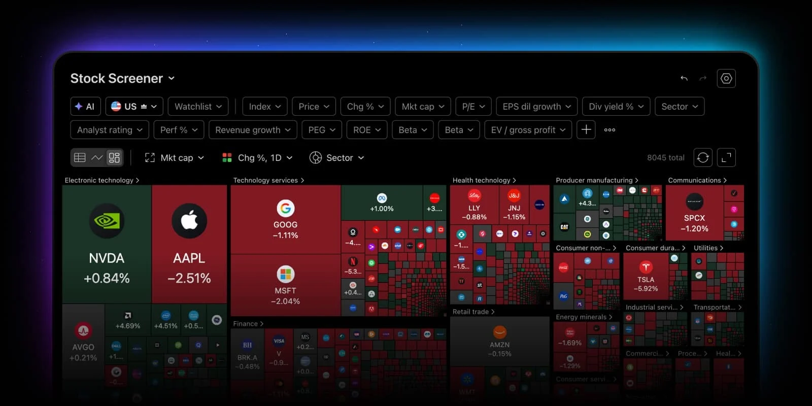
Your existing results, shown differently
TradingView has added a heatmap to Stock, ETF and Crypto Coins screeners. It displays filtered results as colored tiles, preserving filters when you switch views. Users can choose tile size, color and grouping. The selection limit is 16,000 symbols.
The new view is useful when a group is easier to understand visually than as a long table. To read it properly, however, you need to separate three questions: which symbols are included, what makes a tile large and what determines its color.
[1]Read the area and the color separately
TradingView’s heatmap guide explains two visual channels. “Size by” determines each tile’s area using the chosen metric. “Color by” determines its color using another selected measure. For example, company size and price change can be displayed at the same time, but they remain different pieces of information.
The guide describes the familiar positive, negative and neutral color treatment for change metrics, with intensity showing the magnitude within the selected scale. The exact legend matters. A large tile does not automatically represent the strongest gain, and a deep color does not automatically represent the largest company. Our discussion here uses those visual principles; controls in the standalone Heatmap product can differ from the Screener view.
[2]A three-company example
Imagine a filtered group containing only three fictional companies. Their chosen size values are 60, 30 and 10, totaling 100. If those values determine tile area, the first company occupies roughly sixty percent of the available company area, the second thirty percent and the third ten percent. This example deliberately uses simple proportions so the role of size is easy to see.
Now give them hypothetical daily price changes of minus one percent, plus two percent and plus eight percent respectively. The largest company is the negative performer in this example, while the smallest company has the strongest percentage gain. Looking only for the biggest rectangle would miss that difference. Looking only for the strongest positive color would tell you little about the company’s relative size.
Both observations can be useful once phrased accurately: “most of this selected group’s size is in a declining company” and “the smallest company has the largest percentage rise.” Neither observation tells you why prices moved. The map helps you locate a question; answering that question requires looking beyond the color.
Why the selected group matters
Consider two people comparing screenshots. One has filtered for a particular industry, while the other is looking at a broader market. Even if both use the same size and color settings, their maps describe different populations. A striking patch of green in one screenshot cannot by itself establish that the whole market rose.
For a useful comparison, write down the filter set, the size metric, the color metric and the period. Keep these constant when comparing two observations over time. If you deliberately change one, say which one changed. This simple record makes it easier to distinguish a market change from a change in how you asked the display to organize the data.
In our three-company exercise, removing the largest company leaves only values of 30 and 10. The remaining area is now divided three-to-one. The middle company becomes visually dominant without changing its own value. That is a change in the selected population, not evidence that the company suddenly grew.
A practical way to use the new view
Begin with the table to confirm which symbols passed your filters. Switch to the heatmap to identify concentrations or unusual colors, then return to individual records for detail. This is our suggested sequence for investigation. It keeps the overview connected to the exact members of the group.
The interaction below helps you choose what a display should communicate. It is not a live map or a ranking of investments. When sharing a heatmap observation, include its settings in the caption and explain the specific pattern you saw. A readable picture becomes useful analysis only when another reader can understand what its size, color and boundaries mean.
Read size and performance separately
Choose an illustrative case to follow the explanation.
| Case | What it means |
|---|---|
| Size 60; change−1% | Largest, but declining In the invented three-company group, the largest tile has a negative price change. |
| Size 10; change+8% | Smallest, but strongest percentage rise The smaller tile has the largest percentage gain in this example. Area and color answer different questions. |
Original learning exercise; no live market data or account action.
- Changing the view preserves the selected filters.
Official sources & further reading
Independently written from the primary sources below. Checked on 26 September 2026.
- Visualize your Screener results with heatmap view ↗Announcement · 9 September 2026
- TradingView’s guide to heatmap size and color ↗Official product documentation
30-day trial + $15 first-plan coupon
New-user eligibility applies. No code needed; check renewal pricing and coupon terms.
Permanent partner link. Campaign dates and benefits are separate.
We may earn a commission, at no extra cost to you. Account and country conditions apply.